Sunday, 30 March 2014
Message To The Moderater
Hello,
My research and planning posts are from June 2013 onwards. My trailer, magazine and poster progress are documented from January to just before my evaluation. My evaluation was posted at the end of March and my final product and ancillary tasks (poster and magazine) are posted below. I hope you enjoy looking through my blog.
Emma Hibbert.

Evaluation: Question Four- How Did You Use Media Technologies In The Construction And Research, Planning And Evaluation Stages?
Prezi showing main technologies used-
List Of Technologies Used-

I used twitter a lot when it came to getting social networking feedback. As I have around 400 followers posting links to my work meant that I was getting a wide sample of results.

Solvr was used in order to come up with appropriate names for our distibution and company logos as well as my magazine and poster.
Slideshare was a technology I used to the start of the year. It allowed me to put my powerpoints onto blogger which contained social networking feedback results.

Photoshop was used to create and edit my poster and magazine in a professional looking way.

Prezi was a technology that I used mostly for target audience research as it allows you to make a slideshow that is easy to view and then embedd onto blogger.
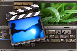
My partner and I used iMovie to edit our trailer together and add in the handheld camera effect.

Garageband was used to create the sound for our trailer. Garageband allows you to add your own sounds as well as using some of theirs in order to produce a professional final product.

I used Firefox internet to use several technologies such as prezi and solvr.

I used Blogger to document my research and planning as well as my construction and evaluation stages. This allowed me to keep track of all my work as it was all in one place.

DSLR/SLR cameras were used to take still images and record our trailer throughout creating our main product and my two ancillary tasks.

Lastly, I used facebook to collect target audience feedback. Facebook allows you to post links and allows people to comment on what you have put and so this was very useful when collecting feedback.
iShowU-
Evaluation: Question Three- What Have You Learnt From Your Audience Feedback?
This is what I imagine a member of my target audience to look like.

I used makeagif.com to make this. This shows a teenager around the age of 18, who isn't serious but can still understand the mature/scary content of a horror film without being too upset. I chose a male as I believe that stereotypically they are more likely to go and see horror films as they are seen as 'stronger'.
Trailer, Poster & Magazine-
Audience Feedback of Completed Products-
Saturday, 29 March 2014
Evaluation: Question Two - Script
This is the script I have wrote for evaluation question two. I will be using Windows Movie Maker and Windows Sound Recorder a long with savetube in order to save my trailer, take screenshots and embedd them into a video which I can then do a voiceover to.
Question Two: How Effective Is The Combination Of Your Main Product
And Ancillary Tasks?
My magazine is quite different to my poster as through
research I found that magazines tend to have ‘lighter’ colours such as the blue
that I used, whereas for the horror genre the colours seem to be darker and
more distorted hence why I used reds. Although the colours are different the
two are still clearly linked as you can see the static effect is used on both
my poster and magazine- this then links them both to the trailer as the static
effect is something we used to show that it is a handheld camera throughout.
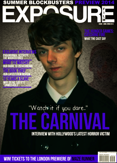
The Carnival fonts are different as this shows that the two
products are different. The poster has to look creepy whereas the magazine has
to advertise the film whilst still looking professional. The tagline of “be
careful if you go looking for something, you just might find it” on the poster
is very effective with combining to the trailer as this is showing the audience
the general plot. At the start of the trailer we see the protagonists using the
handheld camera and saying they are “looking” for ghosts, meaning the two
products are linked well here. The magazine uses the tagline “watch it if you
dare” which shows people right away that this is a horror film, thus meaning it
links to the trailer well as people will know the genre straight away meaning
our target audience will be reached quickly.
The location I used for the trailer is the same I used in
the poster- this shows a good combination as it shows the two are clearly
linked. This also means my poster is doing its job as it is showing some
narrative by setting the scene without giving too much away. For my magazine I
cut out the image, however I ensured you could still tell that the outline of
the clown was visible so that people are able to see the antagonist. By doing
so I combined the magazine and trailer well here as the image I used was
appropriate in showing what the film is about.
On both my magazine and poster I used a gradient effect for
the background- this allows the products to look dark, therefore combining them
with the trailers dark genre. The newspaper cuttings in the trailer have an
aged look to them, and by changing the brightness, contrast and saturation of
the poster I was able to create a similar effect, thus combining the two well.
The representation of character is something that links the
trailer and two ancillary tasks together well, as I have ensured to keep
characters represented in the same way through all three products. For example,
the clown is shown in a medium close up shot on my poster looking creepy,
showing that he is the antagonist. Similarly to this on my magazine he is
behind my protagonist faded slightly- clearly showing that he is negative. By
keeping the clown looking scary and the male protagonist looking normal on the
magazine it shows the narrative of the trailer well therefore meaning the
combination of the trailer and ancillary tasks is done well here.
The hair costume and make up remain the same for the male
protagonist and clown antagonist on both my poster, magazine and within the
trailer. This would help an audience to see that these three products are
linked as there would be no confusion as to who is who.
By using the same character on both my magazine and poster I
believe that this helps to combine them to the trailer well. By using the clown
and one protagonist this keeps things simplistic as I believe adding the female
protagonist would be too much and would make things more difficult to follow.
The narrative is more easy to follow as it is easy to see who is good and who isn’t
and get an idea of what is going on because of this whilst being able to make a
link between all three products.
The male protagonist is a key part of the trailer and so by
having him on the magazine a long with the clown the audience will be able to
have an understanding of the roles, meaning I have combined the magazine and
trailer well in relation to the images I took.
Low key lighting is used throughout our trailer as this is
appropriate to the horror genre as well as being correct for the time of day,
as our trailer is set in the evening. This is something I combined with my
poster as on my poster I used an image took in low key lighting as well as
taking location shots in low key light also. This ensures that my trailer and
poster link, therefore meaning my poster is doing its job by advertising the
trailer in a way that shows what it contains.
Throughout the trailer we used text in order to set the
scene and show the name of our film. We used simple fonts and white text to do
this as this looked professional as it wasn’t too busy. This is something that
can be combined with my magazine as here I used simplistic fonts also in
whites, therefore meaning you can tell the two products are linked here. By
doing so it makes them look neat whilst still getting the horror genre across
as this is a convention that is commonly used.
Throughout the trailer you can see that the clown has red
facepaint, as this shows who the character actually is. This is used when it
comes to combining the products as I used a red text on my poster, and by using
similar colours throughout this is a way in which the products can be combined.
The redish tints used on my poster link with the dark themes in the trailer as
this has connotations of blood and death, thus meaning the two can be combined.
In my magazine, poster and trailer the characters remain in
the same costumes throughout. The male protagonist is wearing a modern coat
which shows the film is set in recent years, whereas the newspaper cuttings and
interviews show that the clown was from a different era. With the poster having
a yellowish tint and only showing the clown this shows that he has been dead a
while as this implies something ‘old’ whereas my magazine shows my protagonist
clearly thus meaning he is modern. This shows the narrative through the three
products whilst keeping them combined effectively.
On my magazine the protagonist is in front of the clown,
showing that he is being followed. This shows the narrative of the trailer as
the trailer shows how they are being stalked by the clown. However on my poster
the clown is alone, this could suggest that he is the more powerful character
as he looks evil and it seems he has defeated everything else- this combines
with the trailer as there is a close up of the clown at the end which I believe
would lead an audience to think that the clown has won.
An area in which I think my combination could’ve been
stronger is the magazine and poster- as although the same protagonist is used
the colour schemes and layout are very different. I did this as through research I found that
magazines tend to be quite neat whereas the poster would have more going on, I
do however believe that although it is clear to see the three products are
linked the poster and magazine perhaps could’ve had something to make them look
more alike.
In conclusion, I think that I have combined my main product
and ancillary tasks well. I have used simplistic, similar text on my magazine
which is not only fit for purpose but also links well with the trailer. On all
three products the colour of the fonts I have used has been white, red or blue
which are all quite dark and therefore have horror connotations. By keeping the
same antagonist on both the poster and magazine this shows the horror genre
well and this evidently means the trailer is presented how it should be. The
costumes used are the same throughout the trailer as well as my poster and
magazine and it is clear that all products are linked meaning the audience
would be able to understand the narrative well while understanding the
characters. This considered a long with
the other points I have made show how I have managed to effectively combined my
main product with my ancillary tasks.
Thursday, 27 March 2014
Research And Planning - Script For Interview #3
This is the script for the first interview we will do- this will be an interview of a middle aged man who doesn't remember what happened and only remembers good things.
Interviewer: What do you know about Mottram Farm Carnival?
Man: That was the carnival wasn't it? We used to go there as kids, it was great. It was the only one in town so it was so popular. We were all so sad when it shut down.
Interviewer: What do you know about Mottram Farm Carnival?
Man: That was the carnival wasn't it? We used to go there as kids, it was great. It was the only one in town so it was so popular. We were all so sad when it shut down.
Research And Planning - Script For Interview #2
This is the script for the second interview in our trailer. This will be a middle aged woman who briefly remembers what happens as her parents were there.
Interviewer: Do you remember what happened at Mottram Farm Carnival?
Woman: Yeah, my mother told me all about it! She said she used to love it there. Wait, didn't something happen? Yeah, that boy got murdered... I guess thats why it closed down.
Interviewer: Do you remember what happened at Mottram Farm Carnival?
Woman: Yeah, my mother told me all about it! She said she used to love it there. Wait, didn't something happen? Yeah, that boy got murdered... I guess thats why it closed down.
Research And Planning - Script For Interview #1
Within our trailer we are including three 'interviews' of the public, asking them what they know about the carnival. The first one will be of a middle aged woman, the next a middle aged man and lastly an elderly woman.
This is the script for the elderly woman who will have the most negative reaction to being interviewed.
Interviewer: What do you know about Mottram Farm Carnival?
Elderly Woman: Oh I remember, it was awful... I was just a little girl when it happened. That poor boy. No, no, I don't want to talk about it. *Puts hand over camera*
Research And Planning - Script For Female Voiceover
We have written a script for the 18 seconds of fast paced montage, this is inspired by the Blair Witch Projects teaser trailer as we felt that this was effective.
Girl: I'm so sorry, we shouldn't have come here. Why did we come here? *Heavy breathing* Where are you? Come back, i'm scared...So scared. *More breathing*
Girl: I'm so sorry, we shouldn't have come here. Why did we come here? *Heavy breathing* Where are you? Come back, i'm scared...So scared. *More breathing*
Friday, 21 March 2014
Completed Poster

I have researched fonts for horror posters and I have found that they are not as 'busy' as mine was however they are still effective. I have used Railway To Hells on 'Carnival' as it stands out whilst not looking too busy and still being effective and looking professional.
Poster Progress

Today I edited the images for the background of my poster and inserted them. I did so by changing the brightness/contrast and the saturation. This now appears to be similar to other posters such as lovely Molly so it is appropriate whilst looking effective.
Thursday, 20 March 2014
Research And Planning - Poster Photos
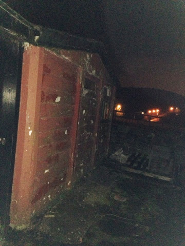
I have decided to add on location pictures to the back off my poster as I think this would be effective and is something I have seen done similarly on the Lovely Molly poster so I know that it is appropriate. The images I took are below and I will pick what I think is most effective, edit it, and use it for my poster.


Thursday, 13 March 2014
Research And Planning - Poster Progress


I was told to make my poster look more dated, and so I used the lovely molly poster for inspiration and made my poster look more dated. I am going to take some photos for the background to make the poster more effective and change the steal tongues slightly.
Thursday, 6 March 2014
Research And Planning - Facebook Audience Feedback
Today I have looked at the audience feedback I recieved in regards to our trailer that I posted on Facebook; some of the comments were 'obvious' (such as working on the sound, which is something we are still working on.) The comments I believe are most important to work on are-
- Cutting down some of the clips- some aren't jumpy enough, too much dialogue is used
- Some parts aren't scary/eery enough
Research And Planning - Editing/Sound

As we have not yet finished our trailer I have created a editing/sound log to see where we are at, and what can be changed. By doing so we will hopefully have a better understanding on what needs to be done and when.
Subscribe to:
Posts (Atom)